


The past couple of weeks, Jon and I have been developing a logo for Life Out of the Box. After several different designs and many drawing programs later, we came up with a concept that we both are very excited to share with you. Below are several of the designs we came up with during the process--we want to include you in development of the logo from beginning to end. Our website’s colors are tropical blue and burnt orange, so we wanted to use these same colors in the logo design for all of our internet marketing. However, we also wanted to come up with a design that would allow us to change the colors when we expand our logo onto retail or develop other branches of Life Out of the Box. We started with a box. Just a square box. We were committed to incorporate our brand’s concept in the design of the logo subtly without explicitly writing out Life Out of the Box. Simpliticy was key to us. So we went from a box to a box with words and cut it down from there. 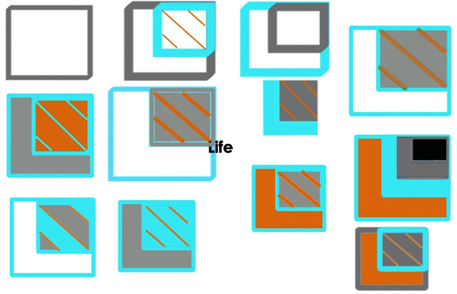

Eventually we decided to forgo including text all togther and got creative. How can we create a logo with a message that was in there but made people think? We put a box inside of a box. Then, instead of including the significantly insignificant words “out of the”, we drew lines that represented those words in the little box. We also drew these lines across the box to represent crossing out the box or removing oneself from the box. After moving the location of the inner box multiple times we saw the opportunity to make the letter L to represent the word Life by placing the smaller box in the upper right hand corner. We played with the colors, width of lines, etc. and will continue to do so. But before we go on, we’re eager to know: which colors do you like for our main logo on the internet?


 Another idea that popped into my head this morning was to make the little box in the big box the same colors as the flag of country we live in. The logo to the right represents the flag of Nicaragua–it includes the same colors and configuration of their national flag. We plan to live here in Nicaragua for a while, but the flag concept also creates an opportunity to incorporate any country we end up visiting, helping or moving to in the future. What do you think about this concept?
  |
| The Nicaraguan Flag |
Our logo is ever-changing and moldable. We welcome any and all comments, suggestions and critiques. This logo is as much for you as it is for us, so please let us know what you think!

Hi Guys, you two are amazing and I watch you with great anticipation to see where your journey takes you. I like the idea of the flag colours being incorporated into your logo – it's flexible, personal to you and yet also speaks of your desire to help the community you find yourselves in. Just my thoughts :)Love and prayers for you both, A. Jan (in Australia) xx
Thank you Auntie J. We continue to work every day on developing our site and hope to continue to make you proud of us everyday. Thank you for your thoughts as well as your constant love and support. We're glad that you like the flag idea!-JB & Quinn
I like the direction your going, but I see you could use some help. I spoke to my buddy j-rob and he said that he would be glad to lend you his graffic design expertise. Let me know if your interested. Your buddy, DD
I like the flag. No need for verbage with the logo. Verbage on the business card, mission statement, etc. will need to leave people begging for more. You two can do that! I like the complimentary colors and my eye goes directly to the white area. Robin, ArtDiva
Thanks DD. any help would be great. We really appreciate your assistance and your kindness. Miss ya buddy
Hi Robin, Thank you very much for your valuable insight. We love the idea of making the viewer want to know more about the company. I am sure the logo will continue to develop, but once again we really appreciate your input. Take care!-Q & JB